Most business card guides stop at aesthetics. This one does not.
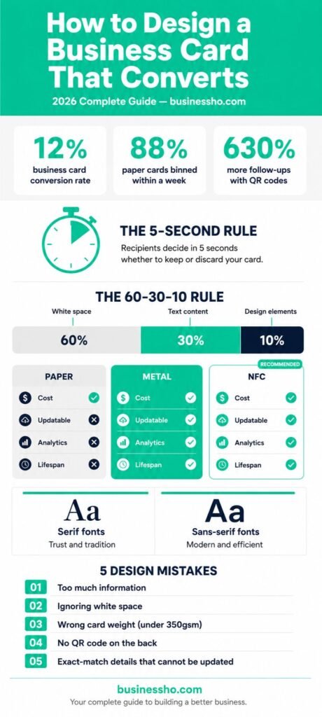
A business card converts when the person holding it takes a specific action: saves your number, visits your website, scans your QR code, or books a call. According to research compiled by Wave Connect, business cards carry a 12% conversion rate, which is significantly higher than the 2.35% average website conversion rate. The difference between the top and bottom of that range is almost entirely design.
Before you choose a font or a finish, define what success looks like for your card. Is it a phone call? A LinkedIn connection? A portfolio visit? Every design decision that follows should serve that single outcome.
The 5-Second Rule: What Your Card Must Do Instantly
You have roughly five seconds before someone decides whether your card earns a wallet slot or ends up face-down on a table. In that window, three things need to happen: the recipient registers who you are, what you do, and how to reach you.
Information Hierarchy
Structure your card the way a reader’s eye moves naturally, from top to bottom, most important to least important. Most cards benefit from this order:
- Your name (largest text element on the card)
- Your role or specific value statement (not a generic job title if you can avoid it)
- One primary contact method (phone or email, not both if space is tight)
- Your website or QR code
- Company name or logo
The 60-30-10 White Space Rule
Clean business card design follows a ratio that professional designers call 60-30-10: 60% of the card is white space, 30% is text content, and 10% is design elements like a logo or colour accent. According to Wave Connect’s design analysis, this ratio consistently produces the highest recall rates in follow-up studies.
White space is not empty space. It is breathing room that tells the reader where to look. Cards that violate this ratio by filling every corner create what Mobilo’s research calls “processing friction,” which your brain unconsciously interprets as a signal of incompetence before a single word has been read.
Typography and Colour Psychology
Font Selection
Typography does more than display information. It communicates personality before the reader processes the words themselves.
Serif fonts (Times New Roman, Garamond, Bodoni) signal tradition, reliability, and authority. They work well for law firms, financial advisers, and established consultancies where trust is the primary selling point.
Sans-serif fonts (Helvetica, Futura, Inter) project modernity, efficiency, and clarity. They are the better choice for technology companies, creative agencies, and startups where forward-thinking positioning matters.
Stick to a maximum of two typefaces per card: one for your name and heading, one for body details. More than two creates visual noise that competes with your message.
Colour Strategy
Mobilo Card’s research on business card psychology shows that deep blues and greys signal authority and trust, while warm tones like burnt orange or forest green suggest approachability and creativity. The most important rule is that your card’s colour palette should match the rest of your brand materials exactly. Inconsistency between your card, website, and social profiles weakens brand recognition rather than strengthening it.
If you are building out your company’s full brand identity, your business card palette should be one of the first things locked in rather than an afterthought at the end of the design process.
Format Face-Off: Paper, Metal or NFC?
The format you choose is not just a material choice. It affects what your card can do, how long it lasts, and what impression it creates the moment someone picks it up.
Paper Cards: High Volume, Immediate Trust
Paper remains the default format for most industries, and for good reason. It is affordable at $0.06 to $0.24 per card, universally accepted, and requires no technology to use. A well-printed paper card on 350gsm or heavier stock immediately reads as premium, a threshold below which cards flex in the hand and trigger a subconscious downgrade in perceived quality.
Paper’s significant weakness: once printed, it is fixed. If your details change, every card you printed becomes incorrect. At 88% discard rates within a week, the ROI on mass-printed paper cards depends heavily on design quality and follow-up behaviour rather than volume.
Metal Cards: Permanent Impression
A laser-etched stainless steel or brushed aluminium card rarely gets thrown away because it feels too valuable to discard. Metal cards run from $15 to $75 per card depending on finish and quantity, making them impractical for high-volume distribution but highly effective as a deliberate leave-behind in executive or luxury contexts.
The trade-off is the same as paper: once produced, the information is permanent. They are best used when your contact details are stable and the impression matters more than the volume.
NFC Cards: Smart Networking with Trackable ROI
NFC (Near Field Communication) cards use the same technology behind contactless payments. A tap against any modern smartphone opens your digital profile, portfolio, or booking page instantly without an app. The information is stored on a server you control, which means updating your details never requires touching the card.
NFC cards start at $14 for standard PVC options and reach $70 or more for metal NFC hybrids. Most platforms integrate directly with CRM systems, meaning every tap adds a contact to your sales pipeline automatically without manual entry.
For a full comparison of all three formats including pricing, durability, and sustainability data, our metal vs NFC vs paper business cards guide covers every variable in detail.
The Back of the Card: Your Most Wasted Space
Most professionals either leave the back of their card blank or print a generic logo. Both are missed opportunities.
The back of the card is where conversion happens. A QR code placed on the back, labelled with a specific promise (“See our recent work” or “Book a free 20-minute call”), generates dramatically higher scan rates than a code placed on the front or labelled generically.
Your QR code should link to a page built for the person receiving it, not your homepage. A portfolio page, a booking form, or a lead magnet converts significantly better than a generic website visit.
Materials and Finish Choices That Change Perception
Card stock weight signals quality before a single word is read. Cards printed on 350gsm or heavier stock feel premium in the hand. Anything lighter bends and immediately drops perceived credibility.
Soft-touch laminate creates a velvety matte surface that is almost impossible to put down once picked up. It suppresses fingerprints and encourages handling, which means the card stays in hand long enough to be read.
Spot UV applies a selective gloss coating over specific design elements on a matte base. A matte card with a gloss logo or brand mark creates tactile contrast that drives repeated handling. As Paperlust’s research notes: “Handling is exposure. Exposure is recall.”
Foil stamping adds metallic accents that catch light and draw attention. It is most effective on a single element, your name or logo, rather than applied broadly.
What to Leave Off Your Card
Every element you remove strengthens the ones that remain.
Multiple phone numbers. Choose one. If you have a direct line and a mobile, pick the one you actually answer.
Fax numbers. It is 2026.
Full postal address. Unless your clients need to visit you physically, a city name is sufficient.
Inspirational quotes. They use space that could carry a value proposition or contact detail that actually moves someone to act.
Social media handles you do not actively use. A link to a dormant Instagram profile does more damage than no link at all.
Design Mistakes That Kill Conversions
Treating every element equally. If everything is the same size, nothing stands out. Your name should be the largest element. Your contact method should be second. Everything else is supporting information.
Choosing fonts that look good on screen but fail in print. Very thin strokes and very small type sizes both break down during printing. Test your design at actual card size before finalising.
Ignoring the bleed area. Any background colour or image extending to the card edge needs 3mm of bleed beyond the trim line. Missing bleed creates white edges on finished cards that immediately signal amateur production.
Designing for paper when you need NFC. NFC card designs require space for the chip, which sits in a specific area depending on the card material and manufacturer. Confirm chip placement before finalising your layout.
Creating a card that cannot be updated. If your phone number, title, or web address has changed more than once in the past two years, a fixed-print format is costing you money and creating confusion. This is the single strongest argument for switching to NFC, where the card stays permanent and the content changes whenever you need it to.
If you are at the stage of planning the financial side of your business, it is worth modelling the total cost of printed cards over 12 months against the one-time cost of NFC before committing to either format.
Your Next Step
A business card that converts does one thing well: it makes the next step obvious and easy for the person holding it. Get the hierarchy right, limit the information, choose your format based on how you actually network, and treat the back of the card as prime conversion real estate rather than an afterthought.
If you are building or refreshing your business identity alongside this, our guides on putting together a company LinkedIn presence and reaching your first clients through local channels cover the next stages of that process in detail.
Your business card is typically the first physical thing someone holds that represents your brand. Make that first impression count.
Alex Bennett is an entrepreneur whose practical tips have helped thousands improve their careers and grow with confidence.